import random
import matplotlib.pyplot as plt
from pylab import mpl
# 设置显示中文字体
mpl.rcParams['font.sans-serif'] = ['SimHei']
mpl.rcParams['axes.unicode_minus'] = False
# 0 准备数据
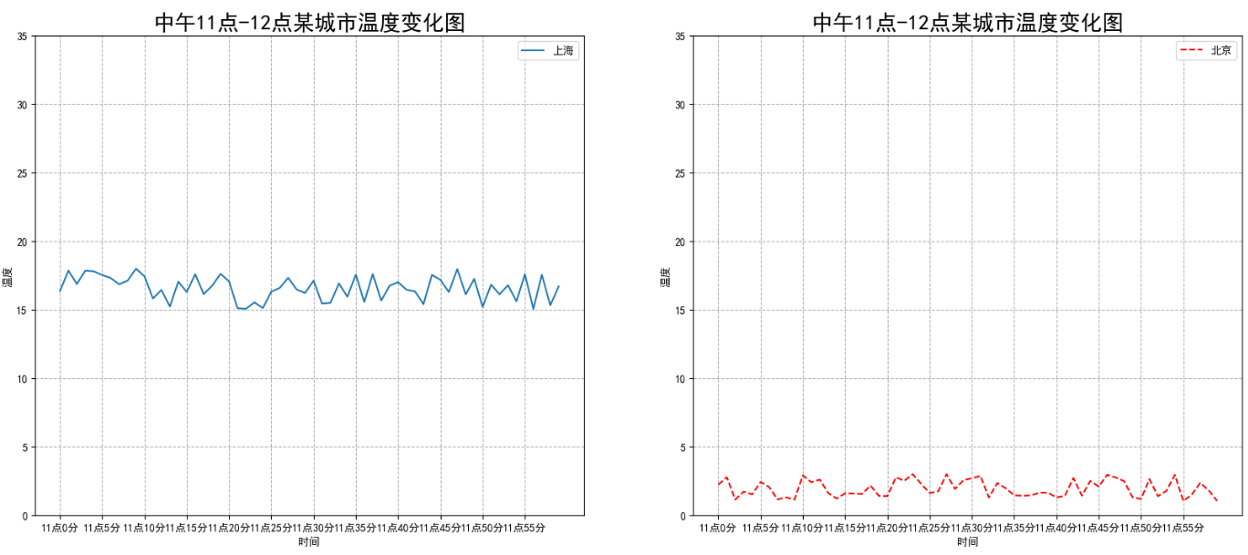
x = range(60)
y_shanghai = [random.uniform(15, 18) for i in x]
y_beijing = [random.uniform(1, 3) for i in x]
# 1. 创建画布
# plt.figure(figsize=(20, 8), dpi=100)
fig, axes = plt.subplots(nrows=1, ncols=2, figsize=(20, 8), dpi=100)
# 2. 绘制图像
# plt.plot(x, y_shanghai, label='上海')
# plt.plot(x, y_beijing)
# plt.plot(x, y_beijing, color='r', linestyle='--', label='北京')
axes[0].plot(x, y_shanghai, label='上海')
axes[1].plot(x, y_beijing, color='r', linestyle='--', label='北京')
# 2.1 添加x,y轴坐标刻度显示
x_ticks_label = ['11点{}分'.format(i) for i in x]
y_ticks_label = range(40)
#
# # 修改x,y轴坐标刻度显示
# plt.xticks5], x_ticks_label[::5]
# plt.yticks5]
axes[0].set_xticks5]
axes[0].set_yticks5]
axes[0].set_xticklabels5]
axes[1].set_xticks5]
axes[1].set_yticks5]
axes[1].set_xticklabels5]
# # 2.2 添加网格显示
# plt.grid(True, linestyle='--', alpha=1)
axes[0].grid(True, linestyle='--', alpha=1)
axes[1].grid(True, linestyle='--', alpha=1)
# # 2.3 添加描述信息
# plt.xlabel('时间', fontsize=10)
# plt.ylabel('温度', fontsize=10)
# plt.title('中午11点-12点某城市温度变化图', fontsize=20)
axes[0].set_xlabel('时间')
axes[0].set_ylabel('温度')
axes[0].set_title('中午11点-12点某城市温度变化图', fontsize=20)
axes[1].set_xlabel('时间')
axes[1].set_ylabel('温度')
axes[1].set_title('中午11点-12点某城市温度变化图', fontsize=20)
#
# # 2.5 图例显示
# plt.legend(loc='best')
axes[0].legend(loc='best')
axes[1].legend(loc='best')
#
# # 2.4 图像保存
plt.savefig('./test2.png')
# 3. 图像显示
plt.show()